Form Builder Guide
Learn how to build custom B2B registration forms with the drag-and-drop form builder.
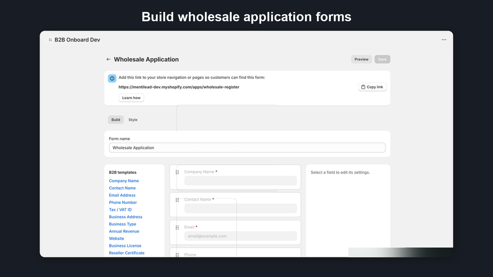
1. Form Builder Overview
The form builder uses a three-column layout designed for intuitive form creation:
- Field Palette (left, 200px) — Browse available field types and B2B templates. Click or drag a field to add it to your form.
- Sortable Canvas (center) — Your form takes shape here. Drag fields to reorder them, click to select and edit.
- Field Editor Sidebar (right, 280px) — Configure the selected field's label, placeholder, validation rules, and more.
Drag-and-drop functionality is powered by @dnd-kit for smooth, accessible interactions.
2. Field Types
B2B Onboard supports 13 field types to cover every B2B registration scenario:
| Field Type | Description |
|---|---|
| Text | Single-line text input |
| Email address with validation | |
| Phone | Phone number input |
| Textarea | Multi-line text for longer responses |
| Select | Dropdown with predefined options |
| Multi-select | Multiple choice selection |
| Checkbox | Yes/no toggle |
| File | Document upload (trade licenses, certificates) |
| Address | Structured address fields |
| Repeating group | Repeatable section of sub-fields applicants add multiple times (e.g. trade references) |
| Heading | Section divider with title |
| Paragraph | Instructional text between fields |
| Step break | Splits a long application into ordered steps with a progress indicator and Next/Back navigation (add two or more to enable the multi-step layout) |
3. B2B Templates
The field palette includes pre-built templates for common B2B registration scenarios. Each template adds a complete set of fields to your form with a single click, saving you time when setting up standard registration workflows.
Templates are designed around real-world B2B use cases such as wholesale applications, reseller registrations, and trade account requests. You can customize any template fields after adding them to the canvas.
4. Editing Fields
Click any field on the canvas to open the editor sidebar on the right. From here you can configure:
- Label — The field name shown to applicants
- Placeholder — Hint text displayed inside the empty field
- Required / Optional — Whether the field must be filled out before submission
- Validation rules — Format constraints such as email validation or character limits
For select and multi-select fields, you can also manage the list of options directly in the sidebar. Each option has three fields: Label (what applicants see), Value (what gets stored), and an optional Customer tag. When an applicant selects an option that has a Customer tag and their application is approved, that tag is automatically applied to their Shopify customer account — alongside the baseline B2B Approved tag and any Approved tags configured in Settings → Customer Tags. Tags are limited to 40 characters and cannot contain commas.
5. Drag-and-Drop Reordering
Drag fields on the canvas to reorder them. Visual indicators show exactly where the field will be placed when you release it. This makes it easy to organize your form layout without removing and re-adding fields.
You can also drag new fields from the field palette directly to a specific position on the canvas.
6. Saving and Preview
Click the Save button to persist your form changes. The entire field configuration is saved atomically, so your form is always in a consistent state.
Use Preview mode to see exactly how your form will appear to customers on your storefront. Preview renders the form using the same layout and styling that applicants will see.
7. Submission Settings
Each form has submission settings you can configure in the form editor:
- Terms and conditions — An optional checkbox requiring applicants to agree to your terms before submitting. You can enter your own terms text.
- Ask about trade credit interest — An optional "I'm interested in trade credit or net terms" checkbox shown below your form fields. Off by default — turn it on per form when you want to gauge interest; existing forms are unaffected. Ticking it is optional for the applicant and never blocks submission, and it simply records their interest — no credit application, decision, or terms are created at registration. After you approve the application, the new company's Credit card shows a "Requested credit" prompt so you can send them a credit application link. See the Credit Applications guide.
- CAPTCHA protection — Enable Google reCAPTCHA v3 to protect your form from spam and bot submissions. This runs invisibly in the background without requiring applicants to solve puzzles. Note: When enabled, Google reCAPTCHA may set third-party cookies. See our FAQ for details.
- Auto-approval rules (Growth plan and above) — Automatically approve applications that meet specific criteria. Two rule types:
- VAT verified: auto-approve when the submitted VAT number is verified as valid via VIES
- Email domain allowlist: auto-approve when the applicant's email matches one of your allowed domains
8. Confirmation Page
Customize the page shown to customers after they submit their application. Each form has its own confirmation page settings, configured in the form editor's Confirmation page section.
- Confirmation heading — The main heading displayed on the confirmation page. Defaults to "Application Submitted".
- Success message — Shown below the heading. Customize this to match your brand voice. Defaults to "Thank you for your application. We will review it shortly."
- "What happens next" steps — A numbered list of up to 3 steps shown below the success message. Each step has a title and an optional subtitle. Use these to set expectations about your review process.
New forms come with three default steps:
- We review your application
- You'll receive an email with our decision
- Next steps will be shared in the approval email
You can add, remove, and reorder steps using the arrow buttons. If you remove all steps, the "What happens next" section is hidden from customers entirely.
Call-to-action button — Optionally add a CTA button to the confirmation page. Check "Add a call-to-action button" to reveal the button text and URL fields. When enabled, a full-width primary button renders above the "Back to store" link, guiding customers to a specific page (e.g., your catalog or a welcome page). When no CTA is configured, the existing "Back to store" link renders unchanged.
Translations — All confirmation strings (heading, success message, "What happens next" steps, CTA button text, and the terms-acceptance checkbox label) are translatable through the Manage Translations page. Default strings — including the CTA text "Continue shopping" and the default terms label "I agree to the terms and conditions" — ship with translations for all 41 built-in locales, as do storefront chrome strings ("Back to store", submission-limit and form-unavailable banners, and the client-side validation error). The translations page marks any field pre-filled from the pack with the hint "Auto-translated from language pack". Type your own value to override the default; clear the field to restore the auto-fill.
Tip: The global review timeframe setting in Settings can also appear as a step subtitle. For more control, configure steps directly on each form.
9. Reapplication Policy
Control whether customers who previously applied can submit again. This is configured per-form in the form editor's Reapplication policy section. Three options are available:
- Allow reapplications (default) — Customers can resubmit applications at any time.
- Allow after 30 days — Customers must wait 30 days after their last application before reapplying.
- Do not allow reapplications — Customers who have already applied will be blocked from submitting again.
10. Languages & Translations
B2B Onboard supports multilingual registration forms. You can enable additional languages and translate all field labels, placeholders, and help text for each language. Multi-language forms are available on Growth and Pro plans — and every plan, including Free, ships with one default form language of your choice (see below).
Default form language (every plan)
Your form's default language is first chosen during the onboarding wizard (pre-selected from your store's country), and you can set or change it any time from the Default language picker in the form editor's Languages card — on every plan, including Free. Choosing a language instantly translates your whole form via the built-in language pack, and the public form is served in that language whenever a buyer's own browser language isn't available — instead of falling back to English. On Free and Starter plans this default language is fully editable on the Manage Translations page; enabling additional languages requires Growth or Pro.
Enabling languages
In the form editor's Build tab, the Languages card sits above the form builder. Click Add language and search from over 40 supported languages. Each enabled language appears as a tag that you can remove. English is always present and cannot be removed. Save the form to persist your language selection.
Built-in Language Pack
B2B Onboard includes a built-in language pack covering 41 languages with translations for common B2B registration fields (company name, contact details, tax IDs, business type, and more). When you enable a language, matching translations are auto-populated instantly — no API calls or waiting required. New fields added to the form also receive translations automatically for all enabled languages.
Fields not covered by the pack stay empty for manual input. You can always edit or override pack translations manually.
Managing translations
Once at least one additional language is enabled, a Manage Translations button appears in the Languages section. Click it to open the translation management page, where you can:
- Select a language from the dropdown to translate into.
- View progress — a progress bar counts every translatable string for the selected language, including form fields and confirmation page strings (heading, success message, "What happens next" steps, and CTA button text).
- Confirmation page card — a dedicated card at the top of the page lets you translate every confirmation string, including the terms-acceptance checkbox label when terms are required. Default strings (heading, success message, steps, CTA "Continue shopping", and the default terms label) are pre-filled from the built-in language pack and marked with the hint "Auto-translated from language pack"; type your own value to override, or clear the field to restore the auto-fill.
- Side-by-side editing — each field shows the English (default) text on the left and the target language fields on the right. Fill in translations for labels, placeholders, and help text.
- Filter untranslated — use the tabs to focus on strings that still need translations.
Click Save when done. A success banner confirms your translations have been saved.
How translations work on the public form
When a customer visits your registration form, B2B Onboard detects their browser language (or an explicit ?locale=xx in the URL). If that language is enabled on the form, the customer sees it. Otherwise the form is shown in your default form language when one is set, and in English as the final fallback. Individual strings without a translation always fall back to their English text.
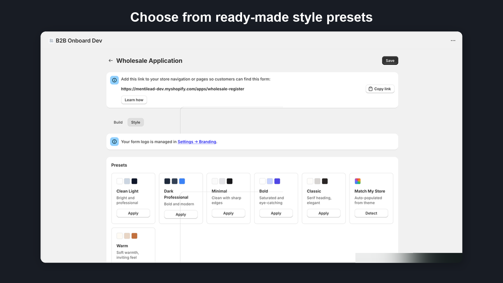
11. Form Styling
Every form has a Style tab where you configure the visual appearance of the registration form. Styling is available on all plans.
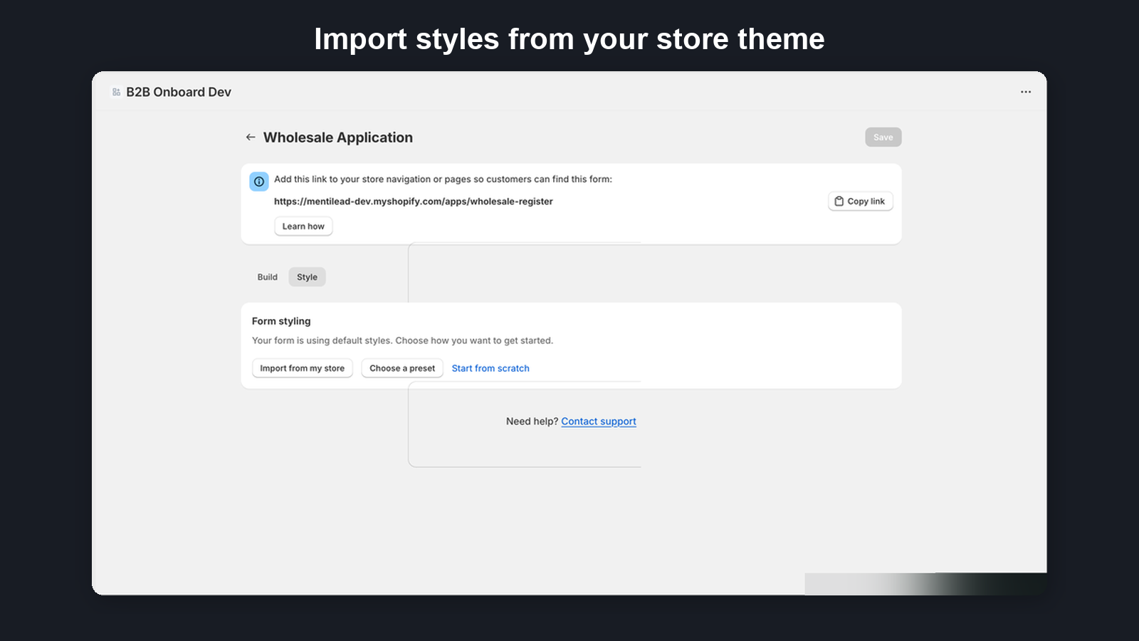
Getting started with styling
- Import from my store — Automatically detect your Shopify theme's colors and fonts
- Choose a preset — Pick from 7 pre-built themes: Clean Light, Dark Professional, Minimal, Bold, Classic, Warm, or Match My Store
- Start from scratch — Begin with sensible defaults
- Copy from another form — Reuse styling from an existing styled form
Color controls (all plans)
- Form background and text colors
- Input field background, border, and text colors
- Button background and text colors
- WCAG contrast checking shows whether your color combinations meet accessibility standards
Typography (all plans)
Choose from 30+ Google Fonts grouped by category (sans-serif, serif, display, monospace).
Shape and layout (all plans)
- Corner roundness (sharp to rounded)
- Form width (narrow to wide)
- Form shadow (none, subtle, medium, strong)
- Column layout — single or two-column form layout
Advanced styling (Pro plan)
- Fine-tune colors: heading color, link color, label color, placeholder text, button hover, focus ring, error colors
- Fine-tune typography: separate heading font, heading/body sizes, font weights
- Fine-tune shape: individual corner radius for inputs, buttons, and containers; container border width and color
- Fine-tune spacing: field gap, form padding, section gap, label gap
- Custom content: rich text header and footer with bold, italic, links, and lists
- Live preview: side-by-side preview panel with desktop/mobile toggle and draft vs saved comparison
- Undo/redo: step through style changes
Responsive behavior
All forms are fully responsive and adapt to mobile screen sizes automatically, regardless of your plan.
12. Multiple Forms and Plan Limits
You can create multiple registration forms, each with its own unique registration URL. This is useful when you need different application processes for different customer types (e.g., wholesalers vs. resellers).
The number of forms you can create depends on your plan:
| Plan | Form Limit |
|---|---|
| Free | 1 form |
| Starter | 3 forms |
| Growth | 10 forms |
| Pro | Unlimited forms |
Each form gets a unique URL that you can share with prospective B2B customers or link to from your storefront.
13. Conditional Rules
Conditional rules let one form adapt to each applicant in real time — show distributor-only fields when someone picks “Distributor”, hide a tax field for an EU region, or skip an entire step for retailers — without maintaining separate forms. Open the Rules tab in the form builder to author them.
Each rule is an if-then statement: a set of conditions and an ordered list of actions that run when those conditions are met. Rules are evaluated on the registration form as the applicant types and whenever an answer changes.
Conditions and combinators
A condition compares one field’s current value using an operator. A rule can have one or more conditions joined by a combinator:
- All conditions (AND) — the rule fires only when every condition is true.
- Any condition (OR) — the rule fires when at least one condition is true.
Available operators: equals, does not equal, contains, greater than, less than, is empty, is not empty, is checked, and is unchecked. Country sources (see below) add two set operators: is any of and is none of.
Country conditions and clusters
Address fields expand in the condition Field dropdown into their own sources — “Business Address — Country” and “Business Address — State/Province” — so a rule can read just the country the applicant picked. (Name fields expand the same way into First name / Last name.)
For a Country source the operators become is any of / is none of, and the value control is a multi-select that lists three ready-made country clusters first, then every country:
- European Union (EU) — the 27 EU member states.
- EU + United Kingdom — the EU plus the UK.
- European Economic Area (EEA) — the EU plus Iceland, Liechtenstein, and Norway.
You can mix a cluster with individual countries (for example EU plus Switzerland). A typical rule is “When Business Address — Country is any of European Union → Make VAT ID required”, or use it to show a reseller-certificate upload only for the regions that need one.
Countries are matched on the ISO country code the address form sends (for example GR for Greece, DE for Germany), so the clusters work the same way regardless of how the country name is displayed.
Your default form already adapts by jurisdiction
You don’t have to build any of this yourself to get started. Every new install’s default Wholesale Application form ships with jurisdiction-adaptive rules pre-seeded, so a single form serves buyers worldwide and adjusts to each buyer’s Business Address — Country in real time:
- EU & UK buyers — the Tax / VAT ID field becomes required (EU and UK VAT numbers are verified automatically).
- Australian buyers — the Tax / VAT ID field becomes required (an Australian ABN, also verified automatically).
- New Zealand buyers — the Tax / VAT ID field becomes required (a New Zealand NZBN, also verified automatically against the NZBN register).
- United States buyers — a Reseller Certificate upload appears so US resellers can attach their certificate.
- Everyone else — a lean form with an optional tax field and no reseller-certificate upload.
There is no market-selection question — rules that don’t match a given buyer simply never fire, so shipping every jurisdiction’s rule costs nothing. These seeded rules are ordinary conditional rules: open the Rules tab to view, edit, or remove them, and they work on every plan. New jurisdictions are added over time as more tax registries come online.
Actions
Actions run top to bottom; if two actions target the same field, the last one wins. You can reorder them with the up/down arrows. The available actions are:
- Show field / Hide field — reveal or hide a field. A hidden field is also excluded from submission so it never blocks the form.
- Make field required / Make field optional — change whether an answer is required.
- Enable field / Disable field — lock or unlock a field for editing.
- Set field value / Clear field value — prefill or empty a field; dependent rules re-evaluate automatically.
- Show step / Hide step — on a multi-step form, reveal or skip an entire step. The wizard never lands on a hidden step.
Conditional rules are presentational: they change what the applicant sees and fills in, but the full application is always re-validated on the server when it is submitted. Rules are optional — a form with no rules behaves exactly as before.
Server actions (Growth plan)
On top of the presentational actions above, a rule can carry server actions that run on Mentilead’s servers based on the applicant’s answers. They never run on the public form — the applicant’s submitted values are evaluated server-side, so a visitor cannot tamper with them. Server actions require the Growth plan and are independent of the legacy VAT/email auto-approval toggle in Settings — you can author them without turning that on.
- Auto-approve application — automatically approves a matching application instead of leaving it for manual review. It composes with VAT verification: by default it only approves when the application’s VAT number has been verified. Tick Bypass VAT guard on the action to approve matching applications even when VAT is not verified (for example, to fast-track a trusted region).
- Tag on submission — records a tag at submission time (visible in the application timeline) and applies it to the customer when the application is approved.
- Tag when approved — applies a tag to the Shopify customer when the application is approved.
Tags from matched rules are merged with your Settings → Customer Tags and any per-option tags, case-insensitively de-duplicated. The tag preview on the application detail page shows exactly which tags Approve will apply, including rule-derived tags.
Submitted values are fixed once an application is received, so tag and auto-approve actions are recomputed at approval from the same answers the applicant submitted. Editing a form’s rules does not retroactively change applications that were already submitted under the old rules.